Invoice and Bill summary (top cards, "You will receive" and "You will pay"): shows your total receivables and payables.
Click the amount to go to the underlying feature.
Click + New Invoice or + New Bill to go straight to creating a new invoice or bill.
Charts (the largest card): lets you switch between different reports and adjust the trailing period shown.
Chart of Accounts (right side): shows a summary of monthly movement for your top accounts.
Click More to go directly to the Chart of Accounts feature.
Reports (right side): shows a list of ledger reports.
Click a report to go directly to that report.
Click More
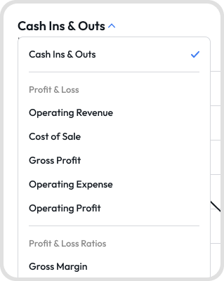
The dashboard's chart card lets you switch between multiple charts, grouped as:
Cash Ins & Outs
Profit & Loss: Operating Revenue, Cost of Sale, Gross Profit, Operating Expense, Operating Profit
Profit & Loss Ratios: Gross Margin, Operating Margin
Cashflows: Net Cashflows, Cashflows for Operating Activities, Cashflows for Investing Activities, Cashflows for Financing Activities
Click the dropdown arrow next to the chart title to switch between them.
The dashboard remembers the last chart you viewed, even after you switch organizations.
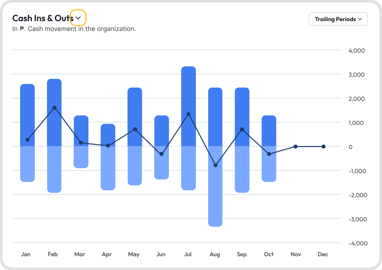
Charts on the dashboard render as either a bar chart or a bar and line chart, depending on which report you've selected.
For a bar and line chart, each bar represents the value for that period, and the line shows the trend across periods.
Hover over a bar or point on the line to see the exact value for that period.
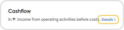
Click Details below the chart to open the exact report behind whichever chart is currently selected.
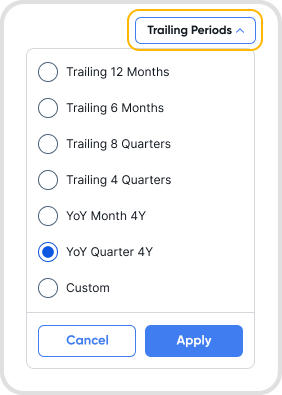
Use the period dropdown next to the chart to change how the data is displayed, choosing from options such as:
Trailing 12 Months
Trailing 6 Months
Trailing 8 Quarters
Trailing 4 Quarters
Year-over-Year (YoY) Month 4Y
Year-over-Year (YoY) Quarter 4Y
Custom
Selecting a Trailing Period gives you rolling time analysis, a Year-over-Year (YoY) option compares performance across years, and Custom lets you manually define your date range.
The chart updates automatically based on your selected period, so you can analyze short-term trends, long-term performance, or year-over-year comparisons.
Accounts shown in the dashboard under Chart of Accounts are accounts with the top 5 monthly movements.
No, only the top 5 non-payment accounts will be shown on the COA card on the dashboard.
Yes, cross-currency transactions are included in the account receivables / payable amounts.
The cross-currency transaction amounts are converted to base currency amounts using the exchange rate of the transaction and then added together with the rest of your transactions made in base currency.